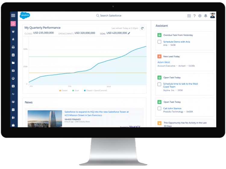
1. The home screen layout
The most noticeable change is the home page layout. Each user can be presented with their very own goal chart, ensuring they can monitor their performance. If the user wants to change the goal/performance they are viewing, the can simply change the goal with just a couple of clicks.
Under goals, the platform presents some handy insights for users. From general industry news to specific news relating to the companies the user is working with. This is a great feature as it gives sales representatives up to date feeds on the latest industry trends. It also allows them to have much better conversations with the customer.
Within the right hand column, you will notice something called the “Assistant”, which according to Greg Gsell, “brings intelligence into the Sales Cloud. Now I can see overdue tasks, I can see leads that have been assigned to me. Plus I can see opportunities in sales fields that potentially have a problem”.
A more streamlined system for Sales representatives…
An example on how this Assistant can help sales representatives includes notifying them if a task is due, or perhaps they need to call one of their contacts.
2. Opportunity workspace
For me, the opportunity object seems more intuitive. It’s a lot easier to identify what is happening with each opportunity.
If for example an opportunity is sent for approval, you can now easily see when it was sent for approval, who it was sent to and at what stage the approval process is at.
You can view the associated contacts related to the opportunity, along with their role and title on the right hand side.
3. The opportunity pipeline
This really is a cool feature. In Salesforce Classic, you could create multiple list views, allowing you to filter opportunities by what stage they were at within the process.
As a user, you can now click on the ’My Opportunities’ tab and all of your opportunities will be listed in a grid format and grouped into columns based on their stage.
You may notice a yellow notification on some opportunities, which is basically a way of making it obvious there are outstanding tasks on that particular opportunity.
4. Awesome dashboard update
The idea of having the ability to increase the number of dashboard columns has been long overdue. With Lightning Experience, users can create up to a whopping nine columns! In addition to that you can adjust the exact width of each dashboard component and the visual graphics engine which is powered by Wave, makes the dashboards look great.
5. Page layouts with added flexibility
With Salesforce classic, you will notice that page layouts follow a standard template. You have the record detail and then following this, the related lists.
With the Lightning Experience, each records layout adapts to the way in which a user would engage with the record. Page layouts can be customised using the Lightning App builder and Lightning components.
Moving from Classic to Lightning – Want to learn more?
If you would like to learn more about using the new Lightning features, I recommend checking out the free modules and projects that Salesforce provide on trailhead.
Need some in-house training?
As specialists in Salesforce.com CRM, we can help your business leverage the new lightning experience, from providing a more in-depth view via Salesforce consultation to in-house training and support.
If you would like more information contact us on info@m4b.co.uk or 0800 678 5183.


